Guest post by Jacob Puhl
 Right now, your website is like a bucket with a hole in the bottom; maybe several. Trickles of your diligent investment to gain targeted traffic are going to waste and the holes must be plugged up before they cost you any more money.
The number of considerations in a strong homepage is vast, making it easy to overlook business essentials that can cost you clients. Here are 9 critical website elements to make sure this doesn’t happen.
1. Obsess Over Your Headline
Even major international companies have some terrible homepage headlines these days. Some famous copywriters say that up to 90% of their time on a project is spent on a homepage’s headline. It’s that important. Take a look at yours now and consider if it accurately conveys your message.
2. Does Your Website Pass the Blink Test?
The so-called “blink test” states that the niche, product and service of your site must be recognizable within three seconds of visiting. If it fails to deliver on this, your bounce rate will be much higher than it needs be. Relevant images and a strong headline go along way here.
3. Logical Layout and Menu Structure
It doesn’t take a professor in usability testing to know that the logical layout and menu are important for the user experience. But, when was the last time you asked yourself whether yours met this criteria? It’s easy to become overly familiar with your site and asking for feedback from friends or family who’ve never used it before can prove invaluable.
4. A Clear Call-to-Action (CTA)
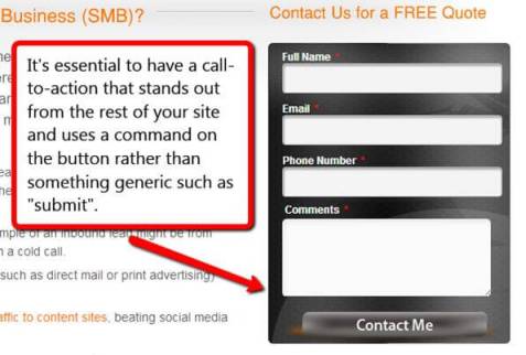
You’re much less likely to see the results you want without calling your readers to action. Have your CTA above the fold and consider including a second down the bottom to save people from scrolling all the way back up. Contrast the CTA colors with the rest of the site and always use a strong command on the clickable button rather than something generic such as “submit.”
5. A Good Reason to Opt-in
A clear and compelling CTA is one half of the battle. The second is making sure you give people a good reason to do so. Whether this is a free evaluation or report, an informative e-book or other enticing promise, make sure to lead with value when attempting to connect with your potential customers.

6. Testimonials
Social proof is becoming more important than ever and with review sites thriving, there’s even less of an excuse not to include positive testimonials from happy clients on your site. Develop a strategy for gaining as many as possible and enjoy the boost to your conversions.
7. About Us Page
Anyone who’s spent time in Google analytics will know that new visitors regularly flock to the About Us page. Including portrait photos and short bio paragraphs about the team members can help to improve conversions and adds a more personal connection with your audience.
8. Social Media Buttons
It’s rare to see a website without social sharing buttons these days, but it’s so important that it’s still worth mentioning. Make sure you opt for designs which complement your website theme but also stand out to be noticed.
9. A Blog
A blog has long been an essential cornerstone of any good search engine optimization (SEO) campaign. Changes to the Google algorithm over the past couple of years have meant it’s even more important to be generating high quality content. Stamp yourself as the industry authority you are by adding as much niche-relevant value to your blog.
Have I missed anything? Please share.
—————————————————————————————————————————-
Jacob Puhl is Cofounder of Firegang Digital Marketing, a local SEO, web design and digital marketing agency for small businesses. To contact Jacob, email jacobpuhl at www.firegangdigitalmarketing.com or follow him on twitter @jacobpuhl
Share this post!


Connect with me!


Liked this post? Follow my blog for more.
